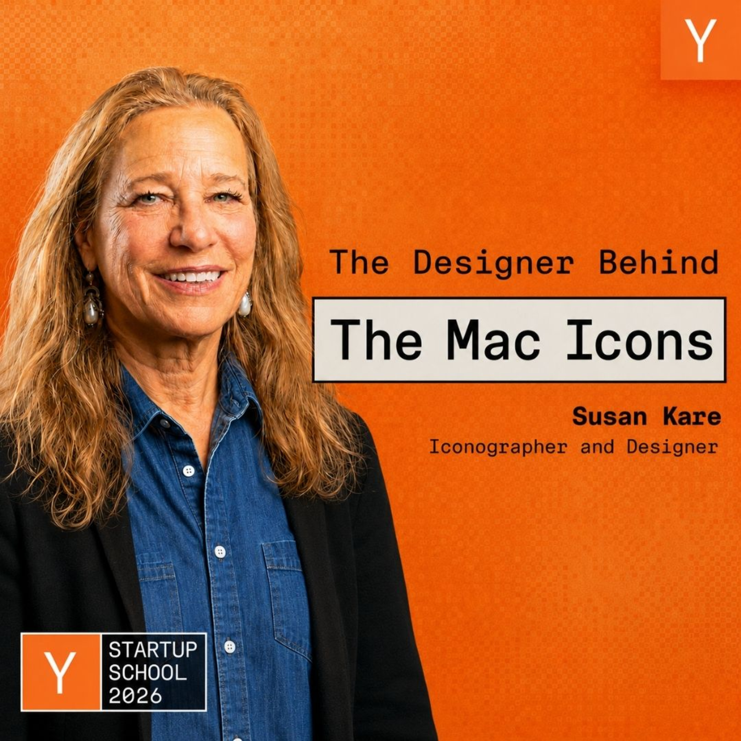
Y Combinator Startup Podcast
Susan Kare: Designing Icons & Graphics For the Original Mac
28 Aug · 52 min
Key points
- Susan Kare designed the original Macintosh's 16-by-16 icons and the nine-pixel Chicago font.
- Mentor Paul Rand said make things meaningful and memorable, then charged NeXT $100,000 for one logo.
- Her Facebook paid-gift program ran just under four years, with the kiss mark as top seller.
The art historian who gave the Macintosh its face
Susan Kare gave the original Macintosh its visual language, drawing the icons and fonts that made a small machine legible to people who did not want to think about computers. She came to it from art history, through a high school friend at Apple. The talk follows that work from Apple to Microsoft and Facebook's paid gifts, and collects the advice she took from mentors like Paul Rand.
Takeaways
- Constraints sharpen the design. On a 128K Macintosh she worked in 16-by-16 black-and-white pixels, and Chicago, the first font she drew, was nine pixels tall in cap height. She says you can be creative inside any constraint, like making art from beach trash.
- Icons need one salient detail. Her bias is a detail or two rather than a lot of extra detail, like a school-crossing sign. The Mac alert icon crops a figure so gender and age stay hidden. Scott McCloud's illustration shows a simple face lets everyone project themselves onto it.
- Product-specific icons age badly. Using a three-and-a-half-inch floppy disk for save tied the symbol to hardware that disappeared. The bomb icon for total system failure brought a call from a user who feared her Macintosh would explode.
- Bring a strong leader several options. Andy Hertzfeld told her to show Steve Jobs a few things rather than one, so Jobs could call something terrible and still pick something. Jobs vetoed an Apple key for shortcuts, and she used the Command symbol, later traced to Borgholm Castle in Sweden.
- Facebook's paid gift icons sold well. She designed icons for the paid-gift programme, which ran not quite four years with a new gift launching at midnight Eastern. The kiss mark was the all-time bestseller and penguin limited editions sold out. Facebook ended the programme rather than compete with third parties.
- She came to Apple from art history. She had a PhD in art history and welded a life-size Razorback hog for an Arkansas museum, then did typographic work at the Franklin Institute before Andy Hertzfeld, a high school friend at Apple, asked her to draw small symbols. Her graph-paper sketches sit in MoMA.
What she learned from others
- Paul Rand started at magazines around 15 and said you do not need many fonts, just to use them well.
- Rand demanded $100,000 for one NeXT logo after Steve Jobs proposed paying five firms $15,000 each, and they paid it.
- Paul Saffo, the futurist, advised allowing extra time.
- Her father, director of the Monell Chemical Senses Center in Philadelphia, advised on fundraising and realism.
- Bud Tribble quoted Alan Kay on user interface design and on nesting things so ease of use seems possible.